Kurtis Patterson is probably not the GOAT
Making batting averages Bayesian

Don Bradman is almost universally considered the greatest batsman of all time, with a Test average of 99.94. In fact, he is widely claimed (usually by cricket fans) to be the best sportsman of all time, which is typically backed up by pointing out how many standard deviations his batting average is above the mean, and comparing that to the greatest of other sports and how comparative few standard deviations they are above their respective sport’s mean. He is quite the outlier, as is visible in charts like this:
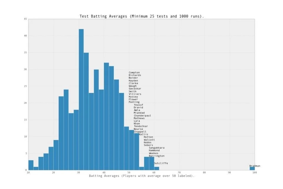
However, this chart is not the whole story. A little adjustment shows that there is someone else, as far ahead of Bradman as he is ahead of the rest of the pack:
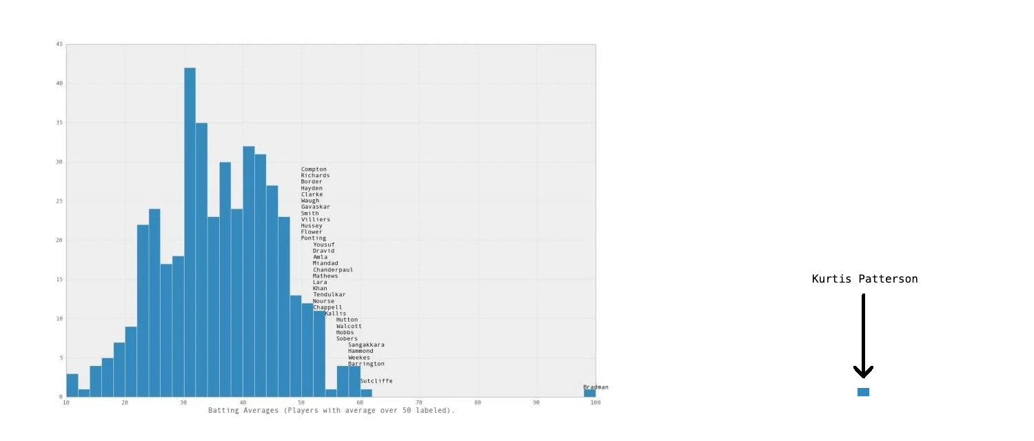
His name is Kurtis Patterson, and he has an eye-popping average of 144. This becomes somewhat less eye-popping when it is revealed that he only played two innings, in which he got 30 and 114*, and then was dropped from the Australian Test side.
Still, one can pretty safely assume that the Don is a better batsman, given his performance was sustained over two decades rather than just two innings. But how good is Patterson? Here I try to answer that question just looking at his two Test innings, without considering other (very useful) information about his first-class career, or other facts about the innings that he played (e.g., the strength of the bowlers he was against, or that in his second innings he was one of three Australians who scored centuries). I omit this more useful information because:
I find it a more interesting question to see how information we can get from these two outings alone; and
This approach is more generalisable, e.g., answering how to evaluate a batter with very few outings.
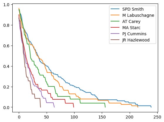
Let's start by getting rid of batting averages and replacing them with something better. The first place to look is at some survival curves of batters.
A tricky problem is that there is some amount of censoring in batters' scores. A batter's innings can finish without them getting out (a) if the game runs out of time and hence is drawn, (b) if they are the last batter standing on their team, (c) if their team declares, or (d) if they successfully chase down their target before they get out. So someone might well have gone on to score 200, but won when they got to 5 runs, leaving them with 5* rather than the much nicer looking 200. Of course, they also might have got out before they got to 6. The way these are factored into the empirical survival curves is the good old default Kaplan-Maier method. To calculate the probability that a batter survives from 10 runs to 11 runs, I count up the number of times that they got out on 10 and divide that by the number of times they get out on 10 plus the number of times they make it to 11. So if a batter has a 50*, then that not-out score has the effect of increasing their survival probabilities for every run under 50, but does nothing for 50 and above. However, if they have a 50 where they got out, that score has the effect of increasing their survival probabilities for every run under 50, increases their probability of getting out on 50, and has no effect on anything beyond 51. Then to get the (again, empirical) probability that the batter makes it to, say, 40, I multiply together the probability of the batter surviving from 0 to 1, 1 to 2, …, 39 to 40. There is a little wrinkle with batters whose top score is a not-out (e.g., David Warner's 335*), but for those cases I assume they would have got out next ball to stop the computer from exploding. Here are some empirical survival curves:
One thing that might be more informative is the hazard function, which is the batter's probability of getting out before getting another run. Here is what it looks like for Steve Smith:
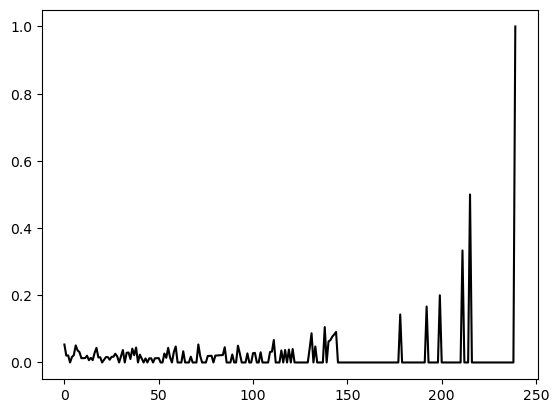
Unfortunately that is very noisy for the higher numbers, and it is hard to see any patterns just yet. Maybe it is uniform, but squinting at this graph isn't going to be any help. To de-noise this data, we can reduce variance by including more than one batter in the sample. This won't be useful if all the batters are of significantly different skill, so I will group them according to how much area is under their survival curve, which is effectively their batting average (it differs slightly, but I will get to that later). This is what you get by averaging over 60 of the batters who have the most area under their survival curves:
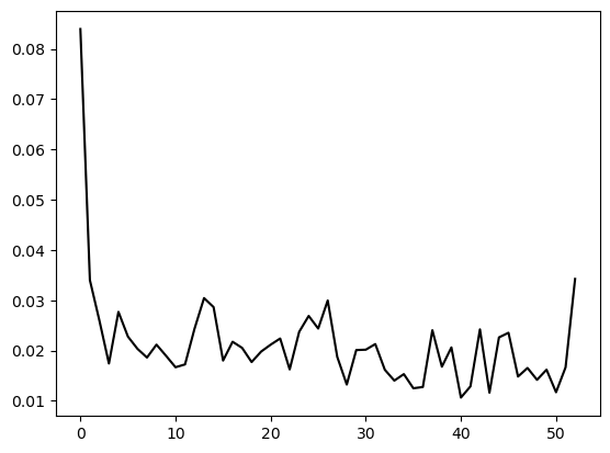
There is a robust pattern which appears for any large number of batters who have about the same area under their survival curves, which is that there is a significantly higher risk of getting out on 0, and then the hazard decays as they get more runs. (There is usually a spike at the end, because the chart ends at the lowest N for which any of the batters have not scored N, so there is a selection effect which makes noise in that part of the graph look like a signal.) This is a well-known effect of batters "getting their eye in", or being harder to get out the longer they have been in. But this could be down to another effect: for a given innings, their hazard might be constant, but if it varies between innings, then a batter's having stayed in for some time is evidence that it is a low-hazard innings, which suggests that they will go on to score more.
Fitting a hazard function by eye, I settled on there being a constant baseline hazard, an additional amount of hazard that decays exponentially the longer the batter stays in (with half-life of 25 runs) half the size of the baseline, and a special extra amount of hazard for when the batter is on 0, which means they have a 4 * baseline probability of getting a duck.
If the hazard rate were constant, then the batting average would be a perfect measure of batter skill. This is because 1 / average is just about the maximum likelihood estimator for a player's hazard rate. Assuming the batter's scores are exponentially distributed (i.e., they are continuous), let the batter's scores for when they got out be denoted X_i, and when they did not get out let those scores be denoted Y_i. Then the likelihood for a given hazard rate is L(λ) = Π(λe^{-λX_i}) Π(e^{-λY_i}), which is maximised at λ = n / (ΣX_i + ΣY_i), where n is the number of times they got out. This is just the reciprocal of their batting average! (I am still waiting for Substack to add inline LaTeX…)
It gets a little knottier in the discrete case. The probability that a batter with hazard rate r gets n runs in an innings is r(1 - r)^n, and the probability that they get m runs or more before getting out is (1 - r)^m, which is the relevant quantity for considering not-out scores. Then the likelihood that a batter gets exactly all of their scores is r^w (1 - r)^s, where w is the number of times they got out, and s is the total number of runs scored. Again maximising log likelihoods, the maximum likelihood estimator of r is w / (s + w), so 1 / r is their batting average plus 1. So batting average is a very natural measure of a player's ability.
However, the hazard rate is not constant, as observed above. Nevertheless, a maximum likelihood estimator can still be found, because the form of the hazard function above gives probabilities of batters scoring any number of runs. Sadly, this does not have an easy closed form solution like when the hazard rate was assumed to be constant, but still it can be numerically optimised. Here are the baselines it finds for the following batters, with the fit survival curve compared to their empirical survival curves:

The last plot might suggest that this curve is sometimes a poor fit for bowlers, but this is about looking at players who don't have batting at their short suit - a good fit on players who aren't specialist bowlers is much more important. And luckily batters tend to have survival curves of almost the exact same shape, as can be seen by picking a number of batters who have about the same area under their survival curve:
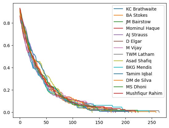
This estimated baseline hazard number is somewhat harder to interpret than more widely used numbers, like batting average. However, there are two ways that it can become a bit more intuitive.
First, baseline hazard is the probability that, after a batter has got their eye in, they get out before they get their next run. So once Steve Smith is on 140 or so, he has a 1.4% probability of getting out on his current score, whereas Mitchell Starc has a 3% probability. (I don't use Hazlewood to illustrate this point because it's just a bit too difficult to imagine him reaching 140.) This might seem a bit puzzling, because it looks like these numbers imply that Smith's batting average should be about triple Hazlewood's, when it's actually closer to five times. This effect is explained by the hazard decreasing as one gets more runs. If Smith and Hazlewood are on the same number of runs, Hazlewood is 3x likelier to get out before getting another run than Smith, but Smith tends to get more runs, so Hazlewood's average hazard at the crease is more than 3x Smith's.
Second, baseline hazard can be converted into a number much like a batting average. This gives a number quite close to a batter's average, but not exactly their average, as can be seen here:
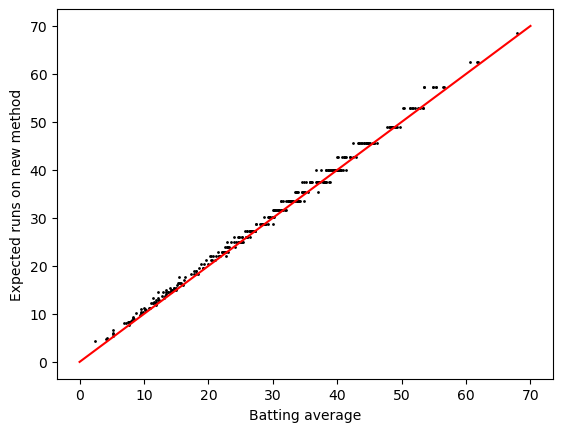
It's a little higher than their average, by about .75 runs. This is because it is answering a different question to batting average. Batting average is their expected number of runs scored before they next got out. This new number is their expected number of runs if they were made to bat until they get out. These are very similar but do come apart. To illustrate, suppose a batter gets to 50 not out. The expected number of runs they would score if they were to continue batting is higher than the expected number of runs they would score if they were to start a new innings, because their hazard is much lower 50 runs into an innings than right at the start. The new number is the former, and the conventional averaging method is the latter, which explains the discrepancy. Still, this new measure gives basically the same figures as a batting average, but it is at least a curious little head-scratcher.
Those with a good memory might remember that the motivating task for this whole business was to evaluate how good Kurtis Patterson is. The maximum likelihood estimator for his baseline hazard rate is 0.006, which puts his expected runs at 149. But that is not a good Bayesian way to go about doing things. Let's first look at the distribution of MLE estimates of players' baseline hazards:
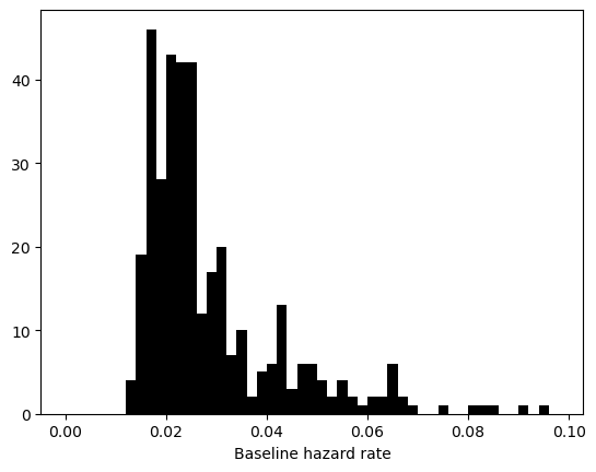
The histogram of batters' estimated baseline hazard looks quite strange. This is because there really are two populations in here: specialist batters (the big peak on the left) and specialist bowlers (the flatter lump on the right). I ignore all-rounders because they are good enough at batting that they can't be separated from the specialist batters: the best all-rounders are much better at batting than the worst specialist batters. In fact, almost all of the players who have an estimated baseline hazard larger than 0.35 are specialist bowlers. So the task now is to fit a distribution to the big peak on the left of the histogram, and ignore most of the bowlers to the right. Anything that can't be negative is probably log-normally distributed (OK, maybe that’s a bit hasty, but it’s a good guess for a quantity like baseline hazard rate), so let's try to fit a log-normal distribution to the part of the distribution that is just batters:
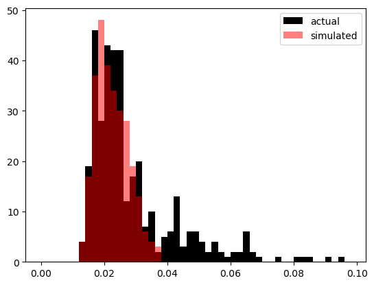
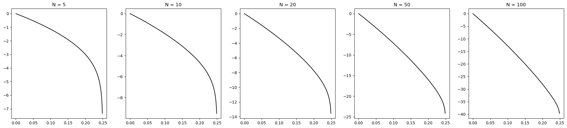
This will be good enough for a prior distribution. And the above calculation of hazards gives likelihoods. The probability of a batter with baseline hazard x getting out on N is the probability of them surviving 0, 1, ..., N-1 and not surviving N. Here is how likely getting N is on a range of baseline hazards. (Note that the minimum possible is 0, which is never getting out, and the maximum possible is 0.25, which is never getting a run, noting that when a batter hasn't yet got a run the hazard rate is 4 times baseline).
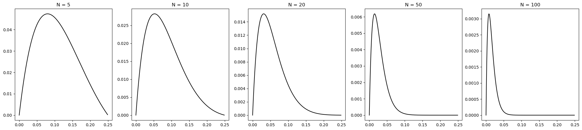
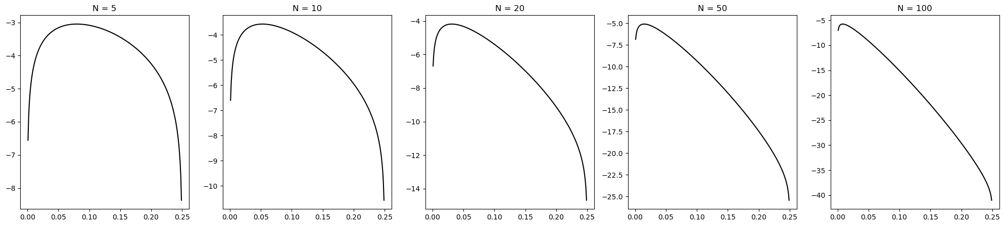
The probability of a batter with baseline hazard x getting to N not out is the probability that they survive 0, 1, ..., N-1. The likelihoods look as follows:
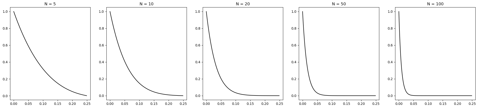
That is everything needed to figure out how good Kurtis Patterson REALLY is. Or rather, what can be made of his two Test innings. Here is his posterior distribution:
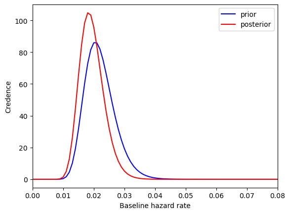
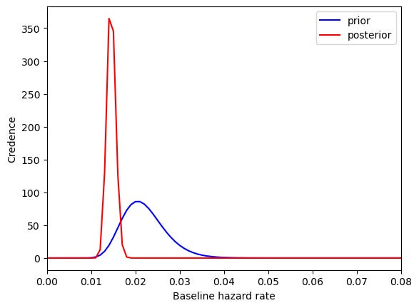
So his two Test scores give us reason to suppose that Patterson's baseline hazard is lower than before we had any information. But the mean has not moved that much, and the width of the distribution shows there is quite a lot of uncertainty. On the prior, a batter's expected runs is 35.6. However, after his two innings, Patterson's expected runs updates to 41.0, which is quite an improvement. This can be compared against a leading batter who played more than two innings, such a Steve Smith. Here is what his posterior distribution looks like:
In the process of doing all this, it looks like we have picked up the machinery to answer some more general questions, we might as well. There are a few interesting lessons that can be got from this:
A promising young batter gets a pair of ducks on debut. This doesn't give very much new information: their expected runs only drops from 35.6 to 31.7.
Ten ducks in a row, however, is quite a bad start to a career: expected runs drops to 19.7. Still, it's quite remarkable that after getting ten ducks in a row, you still expect that, were they to play until they got out, they would get 18 runs, rather than something like 2 or 3 which might seem more plausible.
A pair of centuries will likely have the press going bonkers, but even that dramatic start only suggests that their expected runs is 41.4, rather than the 60+ which many people would expect.
To have one's expected runs be higher than Steve Smith's after only one innings, one must score 561 runs. Alternatively, for a batter's expected runs to exceed Steve Smith's, they need to score 10 centuries in a row.
The common thread is that cricket scores are quite high-variance - as shown earlier, they are even fatter tailed than an exponential distribution - so it makes sense that small sample sizes are not particularly informative. We can chalk that up as another reason to have more cricket.